Improving the User Experience in Notebook LM - [24/10/04]
Google's Notebook LM is an awesome tool for managing sources and getting AI to generate some really solid insights. The overall quality is top-notch, and I've got to give a special shout-out to the podcast feature—it's honestly epic. It's clear this tool has a lot of potential, and it's already great in many ways.
But, as with anything, there are a few things that could make the experience smoother. A few tweaks here and there could take it from “really good” to “absolutely incredible.” Here’s what I’ve noticed that could use some love, and some ideas on how to make it even better.
TLDR:
Notebook LM is powerful, but the UX needs refinement. Simplifying source inputs, adding auto-generated titles, making the interface more consistent, and paying attention to small details would make a huge difference. These changes will not only improve user satisfaction but also help Notebook LM reach its full potential as a frictionless productivity tool.
Ideas for Notebook LM so I am not just complaining but also contributing!
1. Source Upload Process: Too Many Clicks, Too Much Confusion
When creating a new notebook or adding new sources, the upload window is cumbersome. The drag-and-drop area for uploading files takes up too much space, overshadowing other methods of input like pasting links or text. This approach is frustrating for users like me, who frequently use links.
What’s wrong?
- The large "upload source" area dominates the interface, and the more common action of pasting a link requires unnecessary clicks.
- Links and text are separated into different options (e.g., website or YouTube), making it even more complicated.
- Adding a link is a multi-step process. First, I have to click “website” or “YouTube,” then the UI changes, and I need to click again to paste the link—not efficient.


Suggested Fix:
Simplify the interface. Have a split between “Upload” and “Paste link/text” buttons. Let the system automatically figure out whether it’s a link or text and handle it accordingly. Reduce clicks and make pasting links faster and more intuitive.
2. Text Streaming: Breaking the Flow
When asking a question in Notebook LM, the generated text doesn’t stream in—it just pops in all at once. This breaks the natural flow of interaction and can be disorienting for users who are accustomed to seeing AI responses being typed out gradually.
What’s wrong?
- No text streaming. The generated text appears all at once rather than gradually, which is now an industry-standard UX for AI interactions.
- There’s no feedback that something is happening while the text is being generated.
Suggested Fix:
Implement a streaming response so users can see the AI’s progress in real time. It allows us to start reading and processing the response sooner and provides immediate feedback that the system is working.
3. Auto-Generated Titles: A No-Brainer Feature
Right now, when creating a new notebook, the title field is left blank, resulting in a pile of “untitled” notebooks. This creates unnecessary friction and messes with organization.
What’s wrong?
- There’s no auto-generated title based on the content or first input.
- Users end up with many “Untitled” notebooks, which complicates navigation later.
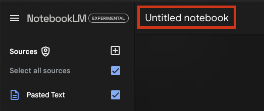
Suggested Fix:
Auto-generate a title from the first few words of content or source links. Users can always edit it later, but this saves time and ensures everything is labeled correctly from the start.
4. Sources: Can't Edit or Extract the Link
After adding sources to a notebook, I can no longer see or extract the actual link I’ve input. The system shows only the title of the linked page or video, which isn’t always helpful for revisiting the source.
What’s wrong?
- Once a link is added, it’s reduced to its page title, and the actual URL becomes inaccessible.
- For notebooks with many sources, this can be very confusing.
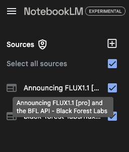
Suggested Fix:
Make the actual link visible or at least accessible with a click. Being able to review the exact URL or edit the link later would improve clarity and functionality.
5. Open/Closed Chat Width Changes: Disorienting Pixel Shifts
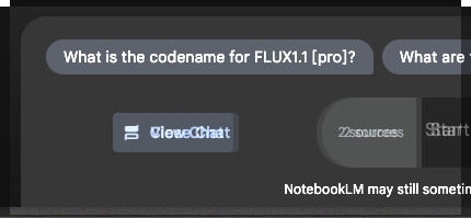
Opening and closing the chat window causes the input field and other elements to shift horizontally. This is visually jarring and slows down interaction as the user adjusts to the changing layout.
What’s wrong?
- The chat window’s width change causes elements like the typing field to shift around, which disrupts the typing flow.
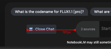
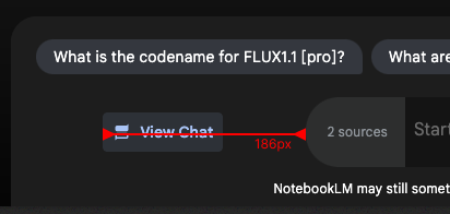
Suggested Fix:
Keep the input field fixed in place and make sure the chat window doesn’t alter the overall layout when opened or closed.
6. Notebook Guide Button: Hidden in Plain Sight
When I first started using Notebook LM, I didn’t even realize that the "Notebook Guide" was a clickable button. The design doesn’t make it obvious that it’s an interactive element.
What’s wrong?
- The Notebook Guide is a critical feature but is visually understated.
- New users might not recognize it as a button at all, leading to confusion.

Suggested Fix:
Make the Notebook Guide button more prominent. Use a distinct color or icon to highlight it, ensuring it’s obvious to new users.
7. Inconsistent UI Elements: The Burger Menu and Logo Shift
Notebook LM borrows a familiar UI pattern from Gmail with the burger menu, but it’s inconsistently applied. When you’re inside a notebook, the burger menu is present, but when you leave to view your notebooks list, it disappears. This creates an awkward experience as the layout shifts and the logo jumps left and right.
What’s wrong?
- The burger menu only appears in editing mode and vanishes in the overview, creating inconsistency.
- The logo shifts position, adding to the visual noise.
Suggested Fix:
Keep the burger menu consistent across all views and ensure the logo placement is stable to avoid unnecessary layout shifts.
8. Pixel Perfection: The Small Details Matter
The pixel alignment in Notebook LM's homepage design could use some attention, and the problem is two-fold:
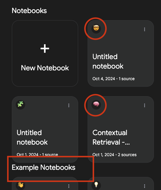
- Emoji Alignment: The emojis in the "Notebooks" and "Example Notebooks" sections are not properly centered. This throws off the visual balance and makes the interface visually unappealing.
- Title Spacing: The title "Example Notebooks" almost overlaps with the notebook cards in the line above. This leads to awkward line breaks, making the layout feel cluttered and cramped.
Suggested Fix:
Center the emojis properly for visual balance. Also, adjust the line spacing between titles and notebook cards to ensure proper breathing room and avoid overlapping elements.
9. Odd Text Formatting: Padding Issues with Titles and Subtitles
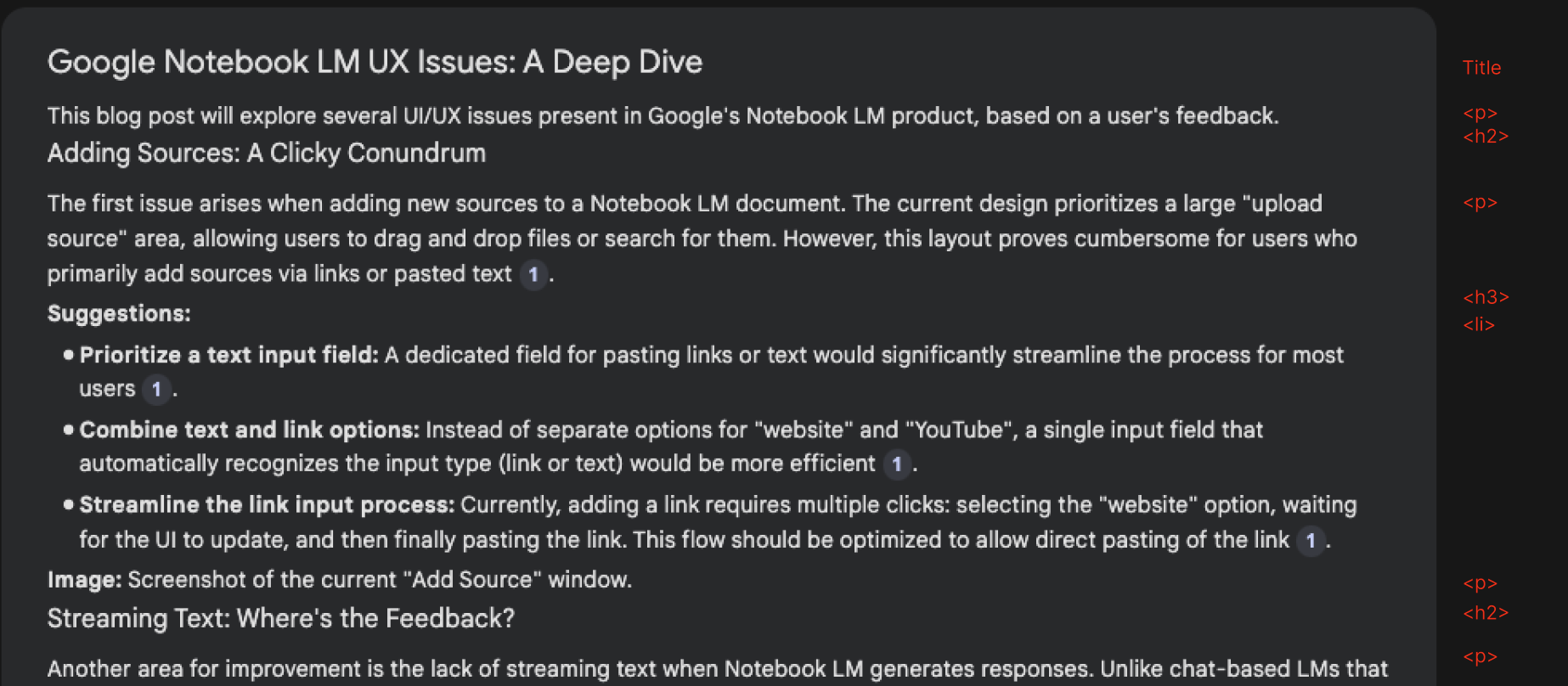
One thing that immediately stands out is the inconsistent padding for titles and subtitles within the Notebook LM interface. As seen in the screenshot (example attached below), the spacing between headers, paragraphs, and lists is just off. This poor formatting makes everything feel cramped and harder to read, affecting the overall user experience.
What’s wrong?
- Titles and subtitles have awkward padding, causing sections to either look too crowded or float oddly.
- The layout lacks a polished, cohesive feel, with titles often appearing too close to the content below, as demonstrated in the screenshot (highlighted in red for emphasis).
Suggested Fix:
Refine the padding between titles, subtitles, and paragraphs. Consistent, well-spaced formatting will make the content easier to read and give the entire interface a more professional and polished look.
Ideas for Notebook LM going forward
10. Bring "Voice" and "Podcast" Features Forward
Right now, the voice and podcast options are buried. They deserve more visibility!
What’s wrong?
- The voice and podcast options are hidden in the background and should be easier to access when creating a new note.
Suggested Fix:
When creating a new note, show "Voice" and "Podcast" as prominent options in a list. Make it a core part of the initial note creation flow.
11. Make Voice Sharable as Video or Generate Engaging Cover
When sharing voice content on social media, it's not visually engaging.
What’s wrong?
- Plain voice notes don’t perform well on social media, where visuals are key.
Suggested Fix:
Turn voice into a video with simple, colored visualizations (e.g., waveforms) or generate a cover image/GIF to make it more engaging when shared.
12. Auto-Populate Note Titles
I have too many notes labeled “Untitled,” which makes organizing difficult.
What’s wrong?
- Notes don’t auto-generate titles, leading to cluttered collections of untitled notes.
Suggested Fix:
Automatically generate note titles based on the first few words or sources added. Let users edit later if needed.
13. Enhance Podcast Experience with Multiple Personalities
The current voice for podcasts is fine, but it’s a little static. More personality would make it more fun!
What’s wrong?
- The podcast feature uses a single voice, which can feel repetitive.
Suggested Fix:
Introduce a third-person podcast feature with varied voices/personalities. Add personality or even switch tones for specific types of notes.
14. Allow Podcasters to Search Beyond the Sources
Right now, podcasters can only work on sources provided within the note, but allowing wider searches would be a game-changer.
What’s wrong?
- Podcasters are limited to the current sources linked within the note.
Suggested Fix:
Enable podcasters to search the web directly from Notebook LM and bring in content dynamically while creating audio notes. This opens up new creative possibilities.
15. GitHub Repo Integration for Podcasters
Developers need tools that help them analyze and discuss code in a human way.
What’s wrong?
- There's no option to import and talk about GitHub repositories, limiting its use for tech creators.
Suggested Fix:
Allow integration with GitHub repos so podcasters can pull in repositories and talk through codebases just like GitHub.com does.
16. Autopublish Podcasts to Spotify
Right now, there’s no direct publishing feature for podcasts.
What’s wrong?
- Manual publishing of podcasts takes extra time and effort.
Suggested Fix:
Allow users to auto-publish podcasts directly to Spotify (or as a podcast format) from within Notebook LM. One-click, done!
17. Offline Access to Notes
Notebook LM could be much more flexible if it allowed access to notes offline, like Google Drive does.
What’s wrong?
- Without offline access, the tool is limited when working without an internet connection.
Suggested Fix:
Provide offline access to notes, similar to how Google Drive allows offline file editing. It would make the tool more versatile for on-the-go work.
18. Personalize Notebook Appearance with Colors and Backgrounds
A bit of personalization goes a long way in creating a comfortable workspace.
What’s wrong?
- The notebook interface is currently too bland with no personalization options.
Suggested Fix:
Allow users to customize their notebooks with colors, backgrounds, and themes. A little personalization makes it feel more like your own space.
19. Custom Fonts for Accessibility
Not everyone uses the same font preferences, especially for those with reading challenges like dyslexia.
What’s wrong?
- Notebook LM doesn’t offer custom font options, which could be an accessibility issue for some users.
Suggested Fix:
Allow custom fonts, especially accessibility-friendly ones like OpenDyslexic (https://opendyslexic.org/). Offering a range of fonts can help everyone feel more comfortable.
20. Auto-Generated Notebook Cover Images
Notebooks are visually dull with no clear cover differentiation.
What’s wrong?
- All notebooks look the same, and the lack of distinction makes it hard to organize visually.
Suggested Fix:
Auto-generate cover images (even just using different colors or simple patterns) for each notebook to make them more visually distinct and engaging.
Have any questions? ping me at X - @nembal